kidstoday
Why do all teenagers love lime green? Is it the acid color that mirrors their teenage agnst? Whatever the root cause, it is the reason many parents approach a teenagers bedroom re-do with trepidation.
Our recommendation is to engage the teenager at one of three levels based on their own level:
- Full of angst and need for extreme self-expression? Be heavy-handed. Give them 3 options. Keep in mind, the options need to reflect them not your need for control.
- Moody? Comes in hot or cold dependent upon the weather or recent Facebook drama? Give them 3-4 options. This time present them as open-ended.
- Sunshine and rainbows? This child doesn't exist. See options 1 or 2.
When tackling this assignment for my own daughter, I approached it as a 2.5. (Yes, I did just make up a 4th option.)
My teenage daughter's wish list started with a color palette and a mural. The colors: charcoal gray and sunny yellow. The mural: a tree.
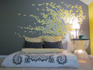 |
The mural on the wall and the arch of the wind
blown tree gently frames her low, loungey bed. |
She fell in love with the graphic
Amy Butler bedspread. We coupled the pattern with the charcoal gray wall for high
contrast. To warm up the space, we added yellow in equally bold
patterns.
PG (Parental Guidance) Pattern Tips: Bold patterns love other bold patterns. Don't be timid. Add large organic patterns like the accent pillows or a geometric (like the zigzag pattern in the long roll pillow).
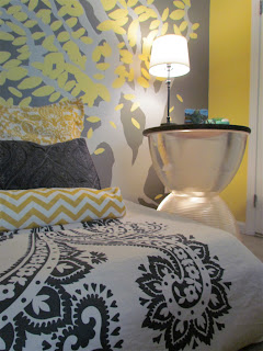 |
| A close-up of all of the room's patterns together. |
PG Budget Tips: Invest wisely. Your teenager will likely get bored with their room if it doesn't get broken first. Family heirlooms exist because your ancestors saw fit to keep it out of teenagers harm.
Our budget friendly idea is the side table. It is made from two industrial light shades. The top is a round wooden disk purchased from local hardware store. The interior is lit by a can light. (Tutorial coming soon.)
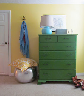 |
Remember, sometimes a teenager can't see the vision.
My daughter didn't want a green dresser. I waited until she
was away for summer camp to paint it. Her first words
were "I love it". |
PG-Color Tips: Left
to her own, the room would of been completely charcoal gray and sunny
yellow. Fine, but a third color can make a big difference. Let
one color play the lead with the rest following. For example, yellow is
the dominant color in this room, taking up nearly 2/3 of room. The
charcoal gray is limited to the accent wall. The white serves as a
needed place for your eye to rest. Even
with a focused color palette, there's still room for pops of color like
the kelly green dresser or turquoise lamp.
 |
| Detail view of dresser |
PG-Function Tips: Function is where two divergent paths may present themselves. My daughter wanted everything on the floor from mattress to mirror. I wanted a traditional bed and a vanity. Compromise, using the bottom half of a trundle bed gives her the lounge-y feel she wanted. Using an artist's easel to hold a framed mirror provided a vanity table, dressing mirror, and a few "that's cool" from her friends.
Whatever decisions or compromises are made remember this...college is just a few years away. Start pinning ideas for your scrapbooking, yoga, paint studio. It will be here before you know it.

 I love you. Matchstick, flatstick, woven and roman I love
you all. I love all of your variegated wood tones. I love how you let the
sunshine dapple in but keep the noisy neighbors out. I love how you do not
discriminate and look wonderful in any décor – no one likes a snob. I love the texture you add to a room. I love the
little wrinkles in your nose as I pull your drawstring. I love how
you quietly complement whatever curtains you are paired with, happy to let them
take center stage, while you play the important supporting partner. I love that
you do not get dusty like shutters or blinds. Or maybe you do get dusty but
your beautiful variegated wood tones hides the dust so thoroughly. I love that
you are not pricey. Oh bamboo blinds, you know me so well.
I love you. Matchstick, flatstick, woven and roman I love
you all. I love all of your variegated wood tones. I love how you let the
sunshine dapple in but keep the noisy neighbors out. I love how you do not
discriminate and look wonderful in any décor – no one likes a snob. I love the texture you add to a room. I love the
little wrinkles in your nose as I pull your drawstring. I love how
you quietly complement whatever curtains you are paired with, happy to let them
take center stage, while you play the important supporting partner. I love that
you do not get dusty like shutters or blinds. Or maybe you do get dusty but
your beautiful variegated wood tones hides the dust so thoroughly. I love that
you are not pricey. Oh bamboo blinds, you know me so well. 


