theperfectcolor...
Choosing the perfect color can be a challenge. Just ask Myrna Loy as she decorates her new home in the 1948 classic Mr. Blandings Builds His Dream House.

Tuesday, August 21, 2012
Monday, August 13, 2012
artsandcrafts
What does Nashville, thorns, and Dolly Parton's blooms all have in common? They were all part of our recent excursion to Nashville where we stayed with our oldest brother, Jim and his wife, Starla. Jim and Starla definitely win the 'hostess with the mostess' award. No matter the hour of your arrival, one is met with hugs, snacks, more towels than one would ever need, and chocolates on your pillow.
While Jim and Starla are known for their hospitality, they're better known for their green thumb(s). With over 200 varieties of roses prospering in their yard, they were brave enough to set us loose with pruners, gloves, and free reign.

Carrol went for any flower as long as it smelled good. The top smeller was a rose called The 'Dolly Parton'. Its double blooms demanded a slightly inappropriate joke by Jim...and then Starla...and then Carrol....and then Jim again.
Paula stuck to flowers in a more monochromatic color palette: pink and pink. Or as she likes to call it: blush and bashful. (One is a much darker shade of pink than the other!)
 |
| Paula working on hard trimming blush, not bashful, roses |
After a few snips and a ready supply of vases, we tackled our own arrangement to keep at our bedside. Despite concerns that our skills would be lacking, here is what we learned...
- Roses have thorns. (Actually we already knew this. We were just reminded of it very quickly.)
- Clip a few other plants/greenery for filler.
- Start with the flowers then add filler.
- Cut both under warm water so they last longer.
- Roses make your room smell super clean.
- Most importantly, it is almost impossible to make something as beautiful as a rose look bad!
 |
| Roses surrounded by Golden Mop |
Sunday, August 12, 2012
painting TIPS from the trenches…

1. Painting a room uses a unique group of muscles not used for
any other task. No matter what kind of shape you are in you will be sore the
next day.
2. One coat paint is a DIY myth.
3. Paint the room in this order:
- ceiling (sometimes optional)
- baseboards and molding
- cut in
- and then walls.
Here’s why:
- Ceiling first because it is going to splatter on the walls.
- Baseboards and molding next because it is easier to cut in the walls than to cut in the molding.
- Cut in next because sometimes you can get away with only cutting in once but you will always need at least two coats of paint on the walls.
- Walls last because if you paint the walls first, the walls are often not dry enough to then cut in. If you cut in first, there is always some part of the wall that will be dry enough to paint.
4. Splurge on good brushes (i.e. Purdy)
5. Your best friend when painting is a small damp rag. It is
not a question of ‘if’ but ‘when’.
6. Throw away paint rollers. (Carrol is one of the cheapest
people you will ever meet but even she throws them away.) It is not worth the
time and mess it takes to clean a roller out.
7. We never take the time to put a drop cloth on my floors. We
always regret not taking the time to put a drop cloth on my floors. Take the
time.
8. Take off the outlet covers. Nothing looks quite as tacky as
paint on the plate covers.
9. You can spend a lot of money on paint accessories – most of
the products are not worth the expense:
- A good angled brush and patience works better than most edging devices on the market.
- Heavy Duty Aluminum Foil makes the best paint tray liner (it always fits the tray you already own).
- An old plastic cup filled with paint makes cutting in much easier.
10. Lastly, with paint, don’t buy the cheapest, but don’t buy
the most expensive either. Middle of the road will get the job done and last
90% of the time. One more thing about
paint, it’s a chemical. While paint companies have worked hard to make paint
green, low- and no-VOC paint is an inferior product. While it’s not PC to be
down on low VOC, we feel like VOC means extra coats of paint and it won’t hold
up to day-to-day wear and tear.
Go forth and paint with confidence and remember the
Twinspired Manifesto # 11: It is almost always reversible.
Monday, August 6, 2012
decoratingwarholstyle
Happy 84th Birthday, Andy Warhol!
On my daily commute today, I heard a great piece about Andy Warhol on NPR. It reminded me of college when I was first exposed to his work and his diaries. A great read by the way.
Warhol was a man of contradictions. He died with rooms full of unopened purchases (underwear, t-shirts, and teapots), but once quipped all you really need is a bed, a plate, a knife, and a fork.
I wondered if this were true, what bed would I pick?
Today, it would have to be Restoration Hardware's French Wing Upholstered Bed. Like its wing chair inspiration, it surrounds you in timeless comfort. For linens, I'd drape the bed in Eileen Fisher Home from Garnet Hill. I love how the textures invite you to come closer. It's inviting without screaming.
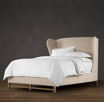 |
| Restoration Hardware French Wing Upholstered Bed |
 |
| Upholstery tack detail of French Wing Upholstered Bed |
 |
| Eileen Fisher Home available at Garnet Hill |
CARROL – what bed would you pick?
While we're waiting on Carrol's response, find other Andy Warhol twinspiration at Flavorwire where they share Andy's best advice on art.
_____________________________________________________________________
PAULA – here is my pick?
If you can only have one piece of furniture and that piece is a bed, Paula's Restoration Hardware's French Wing Upholstered Bed is a superb choice and it would definitely make my top five list. However, this is the bed I would choose...

19th C. Keyhole Metal Arch Bed, also by Restoration Hardware. I am a bit of a purist when it comes to linens and prefer all white sheets and comforters - hotel quality, please! Although, I would not be opposed to a faux mink throw.
 |
| Try ironing your sheets for that crisp, hotel feel. |
 |
| Yummy |
Lastly, if I can only have one plate I would like mine to be a platter.
GenuineFauxInterviews:
Jamie Drake
- Let's get the obvious out of the way: What's your favorite color?
- Favorite color combinations?
- You design a lot in New York. Would you approach a project differently if it were in another city like Des Moines?
- You have an amazing gift for incorporating artwork into your spaces. What is your artwork selection process?
- Where's the best place to find affordable art? What would you call affordable?
- I tend to have one color I don't like for a decade. My 20's was pink. 30's was red. Do colors fall in and out of favor with you? If yes, is there a pattern or rhyme to it? (In case you're wondering...my 20s was in reaction to pink-filled teenage years. At some point my mom decided I was the traditional/girly kid and everything needed to be pink – including luggage. Airport bag mix-up was never an issue.)
- You're really known for color, but we think your ability to use texture is equally amazing. There's something about the way you use shine that makes the color...well... better. How do you do that?
- Is there ever too much color?
- Have you ever had a client that asked for all neutrals? Did you punch them?
- How many fan decks do you own?
For the real thing, check out a few of our favorite rooms by Jamie Drake or his book, New American Glamour available at Amazon:
 |
| New American Glamour by Jamie Drake |
 |
| This bedroom is just the right mix of grown-up, playfulness, and angst for a teenage boy. |
 |
| This is our favorite Jamie Drake design. The painting is the Spirograph we all wish we had made. |
 | |
| We love how Drake decided to hang this collection of silkscreens. |
 |
| We love the energy in this jewel box of a dining room. Who wouldn't want to throw a dinner party in here? |
Thursday, August 2, 2012
artstart:
Good artwork doesn't have to match the couch. In fact, why not have the sofa be inspired by the artwork?
Good artwork doesn't have to match the couch. In fact, why not have the sofa be inspired by the artwork?
This week our twinspiration comes from the 2012 London Olympics. Who wouldn't be twinspired by stellar athletes, gold medals, and national anthems? Who better to encapsulate that spirit than Jasper Johns in his Flag series.
Johns
began the work using enamel house paint, but turned to encaustic – a fast-drying technique using wax and pigment. The process showcases his brushwork with textural variation and hints of what's below.
In all honesty, real appreciation for the Flag series didn't happen until we had the chance to see it in person at MOMA. The layers entice and draw you in for a closer look. What seems so familiar becomes so much more. For the same reason, we think the familiar "Americana" design deserves a closer look.
Key facts about Johns:
Key facts about Johns:
- Flag, 1954–55
- Jasper Johns (American, born 1930)
- Encaustic, oil, and collage on fabric mounted on plywood (three panels)
- The Museum of Modern Art, New York

DETAILS: 1. Ralph Lauren sofa (similar one available at Calico Corners); 2. parquet wood floors in herringbone pattern; 3. Ralph Lauren Hepplewhite Wing chair; 4. Ralph Lauren walnut side table; 5. Ralph Lauren Barrel Back chair in Stripe; 6. John Robshaw Medium Strip Dhurrie Rug; 7. John Robshaw fabric in Ginger Coral; 8. John Robshaw pillows; 9. Golden Retriever: 10. Antique Trophies (check out options on eBay); 11. Doggie News dog toy
Subscribe to:
Posts (Atom)